WMATA
- General Assembly UX Bootcamp
- 2017
Problem
This collaborative project began with a prompt - design a hypothetical app or app feature for Washington DC’s Metro system that would alleviate a major painpoint. We identified this problem: Metro riders are unable to quickly check their SmartTrip metrocard balance or add value while on the go. The current WMATA app des not allow riders to link their SmartTrip cards and manage their account balance away from their home computer. Riders have to wait in long lines to refill their cards, possibly missing their trains or bus connections.
Artifacts
- Competitive and heuristic analyses
- Persona
- User flow and user story
- Wireframe and wire flow
- Low-fidelity prototype
- High-fidelity prototype
Competitive analysis and heuistic review
As a team we conducted a thorough competitive analysis, and then reached consensus on two apps that could inspire solutions for our problem. Both apps, Chik-Fil-A and the Massachusetts Bay Transportation Authority (MBTA) allow users to add monetary value to a linked account. Chik-Fil-A follows a Starbucks model, where the user is able to transfer value via linked credit/debit card or bank account and use that balance to make in-app purchases at brick-and-mortar stores. According to our competitive analysis, MBTA’s app is the only transit app (official or otherwise) that allows users purchase tickets, despite the prevalence of transit-management/information apps on the market.
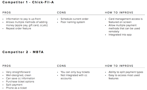
Following the competitive analysis, we identified several areas in which we could improve upon existing app designs to create a WMATA transit app that is both useful and novel:
- Allow users to check their SmartTrip card balance in real-time, and reload if balance is low
- Create an app feature that allows a user to link a payment method to their SmartTrip metro card
Persona and user story
After identifying the core problems, we created a primary persona, Naomi.
When Naomi opens the WMATA app in the metro station, she is able to check her SmartTrip card balance and quickly add money if needed, all before she reaches the turnstiles.
Since Naomi needs a simple and quick app solution, we created a stream-lined user flow, with an emphasis on a minimalist interface and intuitive payment features.


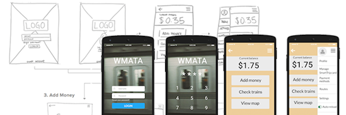
Wireflow
Based on the persona and user story we developed, we know that our app needed to be designed with ease of use and simplicity in mind. Specifically, Naomi should be able to see her balance immediately after opening the app, and she needs to be able to add money to her SmartTrip card in less than the time it takes to enter a station and pass through the turnstile (roughly a minute or so).
Using these guiding principles, our priorities were to create a simple home screen with clear call to actions that prioritized high impact/high value information like current balance. We also valued transparency and simplicity in the add-money process by giving the user the option to toggle back and forth to edit or cancel their payment, as well as providing a confirmation page and a page indicating that adding value to their card was successful. We felt this was an important trust-building feature, giving users confidence in the app.

Usability testing
We created an interactive low-fidelity prototype of our app using Marvel.
Usability testing revealed some flaws that we suspected might be confusing or problematic to users. In the first iteration, the hamburger menu icon was located on the right of the screen, yet in our wireframe the expandable menu extended from the left of the screen. Testers noted that this was odd, as they expected it to extend from the menu icon itself rather than the opposite side of the screen. We also noted a few gaps in logic during the test, such as the lack of a pop-up keyboard during one portion of the payment process.
Overall, however, comments from testers demonstrated they felt our app was easy to use and highly functional in their daily lives.